Zombie apocalyptic theatrical film trailer
Thursday, 31 March 2016
Magazine cover (ancillary text)
Magazine cover

This is my magazine cover (ancillary text) which is called Focus that displays the film The Hunted.
Zombie apocalyptic film poster (ancillary text)
Zombie apocalyptic film poster

Here is the film poster advertising the zombie apocalyptic film The Hunted.
Wednesday, 30 March 2016
Media evaluation
Media Evaluation
Question 1) In what ways does your media product use, develop or challenge forms and conventions of real media products?
Prezi - https://prezi.com/alaqauwcigpm/untitled-prezi/
Slideshare - http://www.slideshare.net/JacquePearce/media-studies-evaluation-question-1-of-poster-and-magazine-cover

My zombie horror trailer conforms conventions of zombie horror genre very closely because genre is convenient for producers and audiences (according to John Fiske) because genre suits the taste for the target audience as it has been constructed by what the target audience enjoys, including themes, typical narratives, stereotypical characters, settings that match the theme i.e. isolation.

 I constructed the conventional feel to isolation using
mise-en-scene within the trailer as the setting is within the woods and empty
lifeless streets in which is isolated which these locations reinforces
isolation which is a used theme within zombie apocalyptic horror films. This
convention used in my trailer creates more vulnerability for the main
protagonists in which will create visceral pleasures (Altman) for the audiences
in which they will experience dread, anxiety and fear for the character due to
the fact of the fear of the unknown. For an example when the audience
anticipates that the protagonists will be confronted by antagonists at any time
but do not know specifically, which creates dread even more so. The
conventional theme of isolation is supported by extreme long shots which make
the protagonists look weaker, smaller and inferior, which reinforces more of
the visceral effect (Altman) of fear and dread as the audience will see the
binary opposite (Strauss) of the antagonists and the protagonists as the antagonist will look more superior and
stronger than the protagonists which is created by the illusion of various
camera shots such as close-up shots of the antagonists (makes the antagonists
look bigger) and low angle shots of the protagonists which makes the
protagonists look smaller. This was inspired by the 28 Days Later theatrical
trailer (Danny Boyle, 2002).
I constructed the conventional feel to isolation using
mise-en-scene within the trailer as the setting is within the woods and empty
lifeless streets in which is isolated which these locations reinforces
isolation which is a used theme within zombie apocalyptic horror films. This
convention used in my trailer creates more vulnerability for the main
protagonists in which will create visceral pleasures (Altman) for the audiences
in which they will experience dread, anxiety and fear for the character due to
the fact of the fear of the unknown. For an example when the audience
anticipates that the protagonists will be confronted by antagonists at any time
but do not know specifically, which creates dread even more so. The
conventional theme of isolation is supported by extreme long shots which make
the protagonists look weaker, smaller and inferior, which reinforces more of
the visceral effect (Altman) of fear and dread as the audience will see the
binary opposite (Strauss) of the antagonists and the protagonists as the antagonist will look more superior and
stronger than the protagonists which is created by the illusion of various
camera shots such as close-up shots of the antagonists (makes the antagonists
look bigger) and low angle shots of the protagonists which makes the
protagonists look smaller. This was inspired by the 28 Days Later theatrical
trailer (Danny Boyle, 2002). 


 Another convention I used within the theatrical trailer is
fast-paced editing as it creates an exhilarating feel for the audience the
visceral pleasure of adrenaline, excitement and fear as it makes the audience
feel like they are there with the protagonist, almost being in the same shoes
as the protagonists within the trailer. This convention is also used to make
the theatrical trailer much more exciting to give a taste for the audience of
what the final product/text would be like if I and my group were to create the
final film. With regards to the pacing of the narrative within the trailer,
there are two different narrative styles to choose from. One of the narrative
styles is slow and dramatic and gradually speeds up, which allows the audience
to invest their emotions into the main protagonists in which the main protagonists
will have similar features, interests and act similar to the stereotypes of the
target audience which allows the audience to invest further their emotions and
attachment of these characters within a shorter amount of time and developing
emotional pleasures (Altman). Also the
pacing of the narrative will settle the audience and make them feel relaxed and
comfortable and by the pace suddenly increasing, the audience will feel more
excited and exhilarated (pulse raiser) in which this sharp integration of
footage from the film from slow to fast will make these visceral pleasures more
effective. I and my group researched this narrative style by analysing the
trailer Resident Evil (Paul WS Anderson, 2002) which starts off slow and
gradually builds up with shorter and quicker shots, faster music. The other
narrative style is where the trailer starts off fast and slightly confusing,
enticing the audience to watch more to find out what is going on (intellectual
puzzles, Altman) and by it being fast it instantly engages the audiences’
attention towards the trailer. I and my group researched this narrative style
by analysing the trailer 28 Days Later which starts off quick (to engage the
audiences’ attention) but then slows using the feature of mystery (intellectual
puzzles, keeping the audience engaged within the trailer)but the pace then
gradually increases to fit within the audiences’ short term and long term
memory. We have created an abstract and
an advertising narrative where different shots from across the film where
included in a seemingly abstract to create buzz and hype. Also it was an
advertising trailer because it revolved around the image of heroic, brave male
hero. The theatrical trailer mainly
emphasises the disruptive period of Tzevetan Todorov’s theory of narratives
which is very conventional. The film started within the original equilibrium
(normal civilization) then a disruption to the equilibrium (apocalypse) and in
the middle of the trailer to the end is the resolving of the disruption of the
equilibrium (main protagonists fighting against the antagonists). We chose to make an abstract trailer as it is
the most conventional trailer used as it suits most of our target audiences’
taste in trailer, also it suits are genre as well as it seen in most trailers
such as Resident Evil, Zombieland and World War Z.
Another convention I used within the theatrical trailer is
fast-paced editing as it creates an exhilarating feel for the audience the
visceral pleasure of adrenaline, excitement and fear as it makes the audience
feel like they are there with the protagonist, almost being in the same shoes
as the protagonists within the trailer. This convention is also used to make
the theatrical trailer much more exciting to give a taste for the audience of
what the final product/text would be like if I and my group were to create the
final film. With regards to the pacing of the narrative within the trailer,
there are two different narrative styles to choose from. One of the narrative
styles is slow and dramatic and gradually speeds up, which allows the audience
to invest their emotions into the main protagonists in which the main protagonists
will have similar features, interests and act similar to the stereotypes of the
target audience which allows the audience to invest further their emotions and
attachment of these characters within a shorter amount of time and developing
emotional pleasures (Altman). Also the
pacing of the narrative will settle the audience and make them feel relaxed and
comfortable and by the pace suddenly increasing, the audience will feel more
excited and exhilarated (pulse raiser) in which this sharp integration of
footage from the film from slow to fast will make these visceral pleasures more
effective. I and my group researched this narrative style by analysing the
trailer Resident Evil (Paul WS Anderson, 2002) which starts off slow and
gradually builds up with shorter and quicker shots, faster music. The other
narrative style is where the trailer starts off fast and slightly confusing,
enticing the audience to watch more to find out what is going on (intellectual
puzzles, Altman) and by it being fast it instantly engages the audiences’
attention towards the trailer. I and my group researched this narrative style
by analysing the trailer 28 Days Later which starts off quick (to engage the
audiences’ attention) but then slows using the feature of mystery (intellectual
puzzles, keeping the audience engaged within the trailer)but the pace then
gradually increases to fit within the audiences’ short term and long term
memory. We have created an abstract and
an advertising narrative where different shots from across the film where
included in a seemingly abstract to create buzz and hype. Also it was an
advertising trailer because it revolved around the image of heroic, brave male
hero. The theatrical trailer mainly
emphasises the disruptive period of Tzevetan Todorov’s theory of narratives
which is very conventional. The film started within the original equilibrium
(normal civilization) then a disruption to the equilibrium (apocalypse) and in
the middle of the trailer to the end is the resolving of the disruption of the
equilibrium (main protagonists fighting against the antagonists). We chose to make an abstract trailer as it is
the most conventional trailer used as it suits most of our target audiences’
taste in trailer, also it suits are genre as well as it seen in most trailers
such as Resident Evil, Zombieland and World War Z.
Another convention me and my group used within the
theatrical trailer was the lighting in which would be seen in many zombie
apocalyptic films in which the contrast of the lighting is grey which
symbolises death, hope fading and isolation which are all convention of a
zombie apocalyptic film/ trailer.

Another convention used was the costumes, props and make-up within me and my group’s theatrical trailer. The protagonists’ costumes are of them wearing coats which symbolises that they are in search of warmth and comfort which describes their character as innocent but at the same time makes them look bigger/ superior which can symbolise their strength and survival skills in which reflects the genre even more.
The iconography of the trailer is the signature weapon (props) a sword which the main protagonist


The colour white and black are
binary opposites (Levi-Strauss) in which they symbolise life and death. The
colours also make the text stand out more and engage the audience even further.
The colours can also symbolise isolation as the colour black envelops around
the white text which can suggest darkness surrounding life and making life
smaller and feel trapped which subliminally shows the audience the conventional
theme of isolation and horror. The central image is of a zombie which is pale
(similar to white) to match the three colour rule. The zombie instantly tells
the audience that the film is based on zombies even further which appeals to
the target audience and engages them even more within the text. The texts that
are in white symbolises the main topics displayed and can also symbolise life
in a metaphorical sense and the lack of white texts makes the topics stand out
which can connote vulnerability and isolation within the film.
The
magazine cover develops conventions of a normal film magazine as it uses a
masthead which says “THE ISSUE OF THE YEAR!!!” the explanation marks helps the
text to stand out more and shouts out to the audience more emphasising what it
is saying. The masthead will also entice the audience to consume the text as it
is glamourised and exaggerating the value of the magazine making the audience
want to consume the text. This
convention is similar to the masthead of the magazine cover TOTAL FILM magazine
which says “The issue of the decade!” which
does the same function as the masthead I have done. The colours used is similar to the colours
used within my magazine cover which is green, red and white which the colour
green symbolises mutation and decomposition within the genre of zombies and the
colour red is used to reinforce gore and danger which zombie films contain gore
and danger.
The text that displays “one of
Jacque Pearce’s greatest creations yet!” will create hype and excitement for
the audience as the it connotes that the film is going to be a masterpiece of
its genre in which makes the audience want to read more facts and details about
the film by consuming this product.
Other conventions used I other
famous films displayed and stories/articles based upon them. This will attract
new audiences to view this text and consume this text. All of the films and
people mentioned on the text is white to make it stand out more to the audience
and it also matches the theme of the magazine cover and reinforces the
conventions of the trailer as white can symbolise life, innocence and hope
which these words are isolated as they are surrounded by other words within the
text that are green which symbolises zombies of decomposition and mutation
which subliminally tells the audience the genre even more.
The text which displays “HALLOWEEN
HAS BEGUN!” instantly tells the audience the main theme of the magazine and
attracts the target audience that like horror which is supported alongside the
main agenda of the magazine the film THE HUNTED which may attract a larger
audience for the film as they will want to consume the product through hype and
buzz being created for the film.
The text that displays “INSIDE: THE
TOP 10 TIPS TO SURVIVE THE ZOMBIE APOCALYPSE!” is used as it creates the
curiosity for the audience to find what the main tips to survive the zombie
apocalypse. This can also explain what the film may be about and will be
intrigued to see if the film uses any of the tips mentioned within the magazine
to help enable their survival. This also puts the audience in the protagonist’s
shoes to what they would do in this situation (intellectual puzzles, Altman).
This creates word of mouth as the audience who read this magazine will tell
their friends and family what they would do in that situation. This process
will keep the audience engaged within the text and also create even more hype
for the upcoming film.
The sticker/circle on the magazine
is of a different shade of green which helps it stand out more than the rest of
the text which displays the text in white. This also reinforces the conventions
mentioned earlier (the colour green symbolising mutation and decomposition of
zombies surrounding the colour white which symbolises life, innocence, and hope
being enveloped by the colour green
which reinforces the conventional theme isolation).
The title of the film THE HUNTED is
in similar font to the brand image of the film title to enable the audience to
recognise and identify the same brand but on different platforms (synergy)
which engages the audience even more within the text. The colour of the font of
the film title is white to reinforce the convention of isolation of life even
further as it is next to the central image of a zombie. The title is big to
stand out to the audience to make it easier to see the film title displayed and
identify what the main story/article will be about to the audience. Whereas the other magazine cover (TOTAL FILM)
does not display the film title as this may be due to the fact that the
magazine article is only aimed the target audience which the target audience
will know what the film is just by looking at the main protagonist as it is
well advertised across different platforms whereas the film The Hunted is new
and is being advertised on different platforms.
The central image chosen for my
magazine cover is of a zombie. The central image of the zombie is chosen as it
instantly tells the audience what the film genre is and is best suited than
displaying a central image of the film’s main protagonist as the target
audience will not recognise the actor as the actor is not well known which is
good as it creates more realism within
the film and trailer as if it was real instead of using a famous actor that
most of the audience will recognise which subliminally distracts them from the
immersion of the film they are watching as it is slightly not believable.
Film poster
The film poster possesses
conventions of a zombie apocalyptic film poster. the film poster reinforces
conventions of the zombie apocalyptic genre as it displays arms of a zombie
trying to grab the maim protagonist which creates the feel of a point of view
aspect for the audience and at the same time it creates a subliminal message to
the audience to grab the product which the grabbing arms creates more value for
the product as it displays that it is in high demand.
Another convention used
is the font colour being of red and of splash effect which reinforces the
conventions of the zombie apocalyptic genre as it connotes blood, gore, evil
and danger which are all elements identified within the genre.
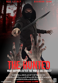

Another
convention that is used is the release date of the upcoming film which is
emphasised in a big font of red which keeps to the theme of the genre but at
the same time it stands out to the audience to notify them of the date which
creates hype buzz and word of mouth/electronic word of mouth as the audience may
tell others through social media which creates even more hype and the audience
will want to find out more details about the upcoming film.
Another convention
used is the billings block which is seen on all film posters and is the font
colour of grey which symbolises death and lack of hope which are conventions
within the genre of the zombie apocalypse.
Another convention used is the central
image displaying the main protagonist as it creates synergy across all texts to
allow the audience to identify that it is the same product/brand and the
central image of the main protagonist helps describe the film best by the
conventions displayed by the main protagonist. the iconography used is the
mask, hood and sword which enables the audience to identify this distinctive
unique character but the appearance creates excitement as it displays action
and the conventional theme of mysteriousness.
Another convention used within
the film poster is the slogan/rhetorical question which create a unique
identity of the brand as the audience will associate the rhetorical question
with the film as it is reinforced within the poster and the theatrical film
trailer.
The use of the rhetorical question creates intellectual puzzles
(Altman) for the audience as they question what the slogan means and creates
hype and excitement as the question sustains within the audience's mind which
advertises the product after the audience has seen the stimulus (film poster,
magazine cover and film trailer).
The convention of actors' names being
displayed at the top of the poster in red font stands out to the audience to
enable the audience to identify the actors names so when they see these actors
names, it will remind them of the product and if the audience recognises these
actors, it will create hype, excitement and word of mouth.
Another convention
used is use of media convergence as there are details of the film's Facebook
page which reinforces electronic word of mouth which helps spread hype and buzz
about the film.
Question 2) How effective is the combination of
your main product and ancillary texts?
My group and I construct a
marketing campaign for a new zombie horror film incorporating a film poster, a
magazine front cover and a film trailer. We chose to base our ancillary texts
on the genre of the zombie horror apocalypse as we as a group find that genre
enjoyable and interesting, plus we know an abundance of codes and conventions
of the zombie horror apocalypse.
For all the texts combined (the
magazine cover, film poster and film trailer) they contain media convergence
and synergy as the brand is displayed across three platforms. Media convergence is used across all platforms
as old media is converged with new media. The old media used for the magazine cover
has the website address “FOCUSMAGAZINE.COM” below the barcode in which
consumers can go on the website to consume more content based around the film,
the similar procedure is replicated again with the old media film poster which
displays the Facebook page address of the film in which consumers can watch
videos of the trailer, find out more
details about the film , share with people the trailer, film poster which reinforces
electronic word of mouth (EWOM). This process is vital within the modern
marketing campaign as the new generation are more tech savvy which consumers
spend most of their time online and by media convergence being used across all
three texts the audience will access the websites they have seen displayed
across all three texts. EWOM is good for the producer and company as it is free
viral advertising which makes advertises the brand and product even further as
thousands of ‘prosumers’ will share details, trailers and posters to others
online as they feel satisfaction from doing this as they feel they have
contributed towards the success of this product and feel ownership of the product. I believe we have
created a very strong brand identity, through the use of the same fonts for the
title of the film “The Hunted” across all three texts, and the use of similar
colour schemes including black, white, red and green. We have built a brand
that clearly communicates the zombie horror genre, as the use of deep reds
clearly signifies blood, while the green colours connote the zombie and sci-fi
themes in the film. This has been emphasised by our use of make-up and
mise-en-scene in the use of imagery of the character’s face on the magazine
front cover, and the he film poster and the use of make-up in the film trailer.
This creates hype and buzz, because the protagonist appears as a zombie on the
two print ancillary texts, and this builds a reputation of mystery and a
dialogue with the audience questioning if the protagonist will survive or not.
Also, our use of degrading and textures on Photoshop and iMovie in all three
texts build a feeling of run-down and dystopian worlds conventional to the
post-apocalyptic genre. To measure how effective our
product was as a whole campaign, we exhibited all of our work to a group of 40
students in our target audience in an assembly. Within the questionnaire
responses one of the questions that was asked was “How well do you think the combination
of all three texts is?” which all respondents of both male and female said that
it was quite and very well. The majority of the males said it was quite well
and the majority of the females said it was very well.
To measure how effective our
product was as a whole campaign, we exhibited all of our work to a group of 40
students in our target audience in an assembly. Within the questionnaire
responses one of the questions that was asked was “How well do you think the combination
of all three texts is?” which all respondents of both male and female said that
it was quite and very well. The majority of the males said it was quite well
and the majority of the females said it was very well.
This tells me and my group that the
synergy and media convergence across all three texts was very effective and has
the same codes and conventions used within all texts. We were expecting to
appeal more to a male audience base, so the greater positive response from the
female demographics in the audience was surprising, however pleasing. This may
be because they were also in our target age-group and life-matrix segment of
‘fun-atic’ and ‘tribe-wired’.
 The film trailer is very effective
as it creates hype, buzz and excitement as it displays conventions that a
normal successful theatrical film trailer would display. The film trailer
displays the date which is June 11th which is very good time to show
the film as it is within the summer months and on a Saturday which is perfect
for our target audience as they will be on the summer break and have plenty of
time to view the film (more convenient for the target audience). They would
also have plenty of time to share information about the film with each other by
word of mouth, and electronic word of
The film trailer is very effective
as it creates hype, buzz and excitement as it displays conventions that a
normal successful theatrical film trailer would display. The film trailer
displays the date which is June 11th which is very good time to show
the film as it is within the summer months and on a Saturday which is perfect
for our target audience as they will be on the summer break and have plenty of
time to view the film (more convenient for the target audience). They would
also have plenty of time to share information about the film with each other by
word of mouth, and electronic word of  mouth (EWOM), and provide free and useful
marketing four our production company. The film poster also displays the
release date which reinforces synergy and media convergence even further and creates hype and excitement
and also word of mouth as more of the target audience are informed of this
product by the film being displayed on various platforms. Our links to social
media on the print texts show an understanding of media convergence, and
encourages EWOM, which is proved to be a highly cost effective and viral
marketing strategy, which would be necessary for promoting and marketing our
film widely. This is a popular genre, and so there would be a wide fan-base for
this.
mouth (EWOM), and provide free and useful
marketing four our production company. The film poster also displays the
release date which reinforces synergy and media convergence even further and creates hype and excitement
and also word of mouth as more of the target audience are informed of this
product by the film being displayed on various platforms. Our links to social
media on the print texts show an understanding of media convergence, and
encourages EWOM, which is proved to be a highly cost effective and viral
marketing strategy, which would be necessary for promoting and marketing our
film widely. This is a popular genre, and so there would be a wide fan-base for
this.
Other
codes and conventions that can be found on all three texts are the characters
of the film being displayed. The main protagonist Dorian is displayed on the
film poster with him holding his signature weapon (iconography) confronting
zombies. Dorian and the antagonists are also displayed within the trailer as
Dorian and zombies (antagonists) are shown in multiple shots. The antagonists
of the film
trailer (Dorian’s strange
doppelganger) are also shown on the magazine front cover which is shown across
all platforms which is what the film is about.
The conventions of the magazine
cover creates hype, excitement and uses intellectual puzzles (Rick Altman) as
it gives the audience little information about the film which gives the
audience more to
 think about the potential of the what the film could show and
be about, therefore generating more buzz from the speculation of the fans. The
use of the colours displayed informs the audience of what the genre is which
creates more excitement and hype as the target audience enjoys films of this
genre and by there being a new film of this genre, they will be intrigued and
want to find out as much details about it as possible. The website of the
magazine that is displayed below the barcode also reinforces media convergence
as the target audience can find out more about the film by going the magazine’s
website. This would particularly appeal to superfans and opinion leaders, and
so we would have to have interesting and interactive features on our film
website.
think about the potential of the what the film could show and
be about, therefore generating more buzz from the speculation of the fans. The
use of the colours displayed informs the audience of what the genre is which
creates more excitement and hype as the target audience enjoys films of this
genre and by there being a new film of this genre, they will be intrigued and
want to find out as much details about it as possible. The website of the
magazine that is displayed below the barcode also reinforces media convergence
as the target audience can find out more about the film by going the magazine’s
website. This would particularly appeal to superfans and opinion leaders, and
so we would have to have interesting and interactive features on our film
website.
 I exhibited my final work to a
theatre of 40 students within my target audience range.
I exhibited my final work to a
theatre of 40 students within my target audience range.
 We also learned from our audience
what conventions where found/ associated with the film trailer. The males that
responded with this question mostly said that they identified the conventions
of isolation and survival. This fits into the main genre of this text as it
includes conventional themes of isolation and survival which is commonly found
in other films of the same genre, which suggests that the text made was
successfully made and fits in well within the genre as this is supported by the
large number of responses from male respondents that answered that question.
We also learned from our audience
what conventions where found/ associated with the film trailer. The males that
responded with this question mostly said that they identified the conventions
of isolation and survival. This fits into the main genre of this text as it
includes conventional themes of isolation and survival which is commonly found
in other films of the same genre, which suggests that the text made was
successfully made and fits in well within the genre as this is supported by the
large number of responses from male respondents that answered that question.
 For the females, they responded by
identifying conventions of death, isolation and survival. Again these
conventions are included within the film trailer which tells us that this film
trailer is successful and fits in within the zombie apocalyptic genre well as
these conventions can also be identified within other film trailers of this
genre such as 28 Days Later (2002) , Resident Evil (2002), and
Zombieland(2009), just to name a few.
For the females, they responded by
identifying conventions of death, isolation and survival. Again these
conventions are included within the film trailer which tells us that this film
trailer is successful and fits in within the zombie apocalyptic genre well as
these conventions can also be identified within other film trailers of this
genre such as 28 Days Later (2002) , Resident Evil (2002), and
Zombieland(2009), just to name a few.
 For the other ancillary text (film
poster) the male respondents answered the question that describes how well does
the film poster fit the conventions of the zombie apocalyptic genre in which
they all said it was quite well and very well with the majority saying it was
very well. This tells us the convention used within the film poster suits the conventions
that are expected within a film poster of this genre which describes the film
well but gives nothing away and creates hype and excitement.
For the other ancillary text (film
poster) the male respondents answered the question that describes how well does
the film poster fit the conventions of the zombie apocalyptic genre in which
they all said it was quite well and very well with the majority saying it was
very well. This tells us the convention used within the film poster suits the conventions
that are expected within a film poster of this genre which describes the film
well but gives nothing away and creates hype and excitement.
 The female
respondents responded by saying the film poster was quite well and very well
which the majority of the female respondents saying the film poster was very
well which also suggests that from both perspectives that the film poster
possesses conventions that is expected within a film poster of this genre. This
tells us that it is successful and fits in well within the genre as these
conventions can be seen within other film posters of this genre such as 28 Days
Later, World War Z and REC.
The female
respondents responded by saying the film poster was quite well and very well
which the majority of the female respondents saying the film poster was very
well which also suggests that from both perspectives that the film poster
possesses conventions that is expected within a film poster of this genre. This
tells us that it is successful and fits in well within the genre as these
conventions can be seen within other film posters of this genre such as 28 Days
Later, World War Z and REC.
 For the question that describes how
suitable the ancillary text of the magazine cover is to the genre of the zombie
apocalypse , the male respondents all said it was suitable to the genre which
suggests that the magazine covers has all the conventions of the genre and the
conventions of a magazine cover. These conventions can be identified by the
target audience and by other audiences to who may not like this genre but are
able to identify the conventions seen within the text which suggests that this
text is successful and fits in well with the genre of the zombie apocalypse.
For the question that describes how
suitable the ancillary text of the magazine cover is to the genre of the zombie
apocalypse , the male respondents all said it was suitable to the genre which
suggests that the magazine covers has all the conventions of the genre and the
conventions of a magazine cover. These conventions can be identified by the
target audience and by other audiences to who may not like this genre but are
able to identify the conventions seen within the text which suggests that this
text is successful and fits in well with the genre of the zombie apocalypse.
 These conventions within the text can be seen
within other magazine covers such as Total Film Magazine that displayed Shaun
Of The Dead and mainly focused on the film which shared similar conventions with
the magazine cover and also with the film magazine Fangoria which displayed the
film Zombie on the front cover.
These conventions within the text can be seen
within other magazine covers such as Total Film Magazine that displayed Shaun
Of The Dead and mainly focused on the film which shared similar conventions with
the magazine cover and also with the film magazine Fangoria which displayed the
film Zombie on the front cover.

I used the internet to research the conventions of a film trailer and a magazine cover by using the search engine Google to find relevant information based upon my genre and the ancillary texts. I also used YouTube to research zombie apocalyptic trailers such as Resident Evil (2002) and 28 Days Later (2002) which I analysed the codes and conventions used within these trailer to help gain a further understanding of what conventions are usually used within a zombie apocalyptic trailer.

I used Microsoft windows desktop computer to help plan the theatrical film trailer by creating the script, narrative and synopsis using Microsoft word. I also used the internet to use the search engine Google to find a website that specialises in downloading storyboard templates for film making. I used the website Sampletemplates.com and downloaded a storyboard for film making to which I printed several sheets of the storyboard to which i drawn the scenes that might be used within the theatrical film trailer.
 For my construction for my
ancillary texts, I used an apple Macintosh computer to design and create my
magazine cover. I used several Photoshop tools such as layering, using shape
tools to create the circle/sticker, gradient and font tools such as using the
dissolved for font titles, crop tools to crop splash marks from the dissolved
font to add to various parts of the background .I used the program Photoshop
to create my magazine cover in which I used several fonts from Photoshop and
from the website Dafont which I used for other various fonts such as damned and
destroy which helps reinforce the conventions of a zombie apocalyptic genre
which will helps the target audience identify the conventions of this genre. For
the ancillary text of the film poster, the program Photoshop was used on an
apple Macintosh computer was used to construct the film poster.
For my construction for my
ancillary texts, I used an apple Macintosh computer to design and create my
magazine cover. I used several Photoshop tools such as layering, using shape
tools to create the circle/sticker, gradient and font tools such as using the
dissolved for font titles, crop tools to crop splash marks from the dissolved
font to add to various parts of the background .I used the program Photoshop
to create my magazine cover in which I used several fonts from Photoshop and
from the website Dafont which I used for other various fonts such as damned and
destroy which helps reinforce the conventions of a zombie apocalyptic genre
which will helps the target audience identify the conventions of this genre. For
the ancillary text of the film poster, the program Photoshop was used on an
apple Macintosh computer was used to construct the film poster.
 The fonts that
were used on the film poster was from Photoshop and from the website Dafont
(can select fonts to download from a list of different fonts) which these fonts
help reinforce the conventions of a zombie apocalyptic film poster which
enables the target audience to identify the genre of this film poster as it
will create awareness for them that an upcoming product/text or help remind
them that the film is coming soon as we want it to be a successful and
mainstream as it possibly can be. On our film poster and magazine front cover,
we used links to the film’s official website. This shows that we understand the
power of EWOM and media convergence, as customers will be encouraged to go
online and explore the film’s website, where they will tweet/share on Facebook
links and information for it, thus providing the company with free viral
marketing.
The fonts that
were used on the film poster was from Photoshop and from the website Dafont
(can select fonts to download from a list of different fonts) which these fonts
help reinforce the conventions of a zombie apocalyptic film poster which
enables the target audience to identify the genre of this film poster as it
will create awareness for them that an upcoming product/text or help remind
them that the film is coming soon as we want it to be a successful and
mainstream as it possibly can be. On our film poster and magazine front cover,
we used links to the film’s official website. This shows that we understand the
power of EWOM and media convergence, as customers will be encouraged to go
online and explore the film’s website, where they will tweet/share on Facebook
links and information for it, thus providing the company with free viral
marketing.

 iMovie was
also used to record narration to go with the theatrical trailer which helps
describe what is seen on screen and also creates intellectual puzzles for the
audience and the narration also reinforces conventions of a \zombie apocalyptic
trailer as the narration is being told by the perspective of the main
protagonist. Google, the internet and the website Dafont was used to download
the font that was desired to be used to display the details surrounding the
film on the theatrical trailer such as the release date, year and the film
title. the program fireworks was used to help construct the
production/publisher company "Red Door Productions" which was chosen
as it suits the zombie apocalyptic genre and the horror genre as the door that
is red can symbolise that the viewer is entering a sinister and evil world as
the door is open and transitions to the beginning of the theatrical trailer/film which helps the
target audience identify the conventions of this genre just by seeing the
conventions used of the logo displayed before the theatrical trailer starts.
also it is very original as it has never been done before and the target audience's
memory of the film trailer will trigger when see the symbol appear which they
will as doors are seen everywhere which can suggest that the target audience's
viewing of the text will be sustained which helps sustain hype and excitement
based upon the theatrical trailer that they have seen.
iMovie was
also used to record narration to go with the theatrical trailer which helps
describe what is seen on screen and also creates intellectual puzzles for the
audience and the narration also reinforces conventions of a \zombie apocalyptic
trailer as the narration is being told by the perspective of the main
protagonist. Google, the internet and the website Dafont was used to download
the font that was desired to be used to display the details surrounding the
film on the theatrical trailer such as the release date, year and the film
title. the program fireworks was used to help construct the
production/publisher company "Red Door Productions" which was chosen
as it suits the zombie apocalyptic genre and the horror genre as the door that
is red can symbolise that the viewer is entering a sinister and evil world as
the door is open and transitions to the beginning of the theatrical trailer/film which helps the
target audience identify the conventions of this genre just by seeing the
conventions used of the logo displayed before the theatrical trailer starts.
also it is very original as it has never been done before and the target audience's
memory of the film trailer will trigger when see the symbol appear which they
will as doors are seen everywhere which can suggest that the target audience's
viewing of the text will be sustained which helps sustain hype and excitement
based upon the theatrical trailer that they have seen.


For the evaluation, Microsoft window desktop was used to create a questionnaire to allow the audience to assess all three ancillary texts to help give me and my group feedback based on our ancillary texts. The questionnaire was created using the program Microsoft word which is easy to use and the questionnaire can be made proficiently. I also used the Microsoft windows program Microsoft Excel to help collate the data and present the data in bar graph form to help show the significance of the data.

think about the potential of the what the film could show and
be about, therefore generating more buzz from the speculation of the fans. The
use of the colours displayed informs the audience of what the genre is which
creates more excitement and hype as the target audience enjoys films of this
genre and by there being a new film of this genre, they will be intrigued and
want to find out as much details about it as possible. The website of the
magazine that is displayed below the barcode also reinforces media convergence
as the target audience can find out more about the film by going the magazine’s
website. This would particularly appeal to superfans and opinion leaders, and
so we would have to have interesting and interactive features on our film
website.
The codes and conventions of the
film trailer make the audience feel various visceral effects which the target
audience’s memory will trigger when viewing the magazine cover and the film
poster that they experienced whilst watching the film trailer which they may
feel a low stimulation of excitement and adrenaline when identifying the film
title’s name The Hunted. The title sounds full of action and outdoor scenes,
which we marketed effectively to our rugged traditionalists through use of
imagery and footage of outdoor settings in all three texts. Additionally, the
images of graphic blood and the effects of violence will create the visceral pleasures
enjoyed by fans of this genre, as it suggests that there are exciting and
bloodthirsty scenes in the film. As a result, the film marketing campaign
effectively appeals to its target audience of especially male viewers, aged 15
and above. The conventions of the film
magazine subliminally conditions the target audience who enjoyed the film,
which they will associate the visceral effects they experienced whilst watching
the film trailer when they see the film title’s name on various platforms such
as the magazine cover and film poster which makes all of the texts more
effective.
Overall, these conventions
displayed across all texts makes it easier for the audience to identify what
the brand product is when they see these images on different platforms without
seeing the title. I feel that this one of our key strengths in the project.
Question 3) What have you learned from your
audience feedback?
 I exhibited my final work to a
theatre of 40 students within my target audience range.
I exhibited my final work to a
theatre of 40 students within my target audience range.
I have learned that the audience
feedback has a positive correlation with the audience profiles that is expected
for our target audience which is rugged traditionalists, tribe wired, fun/Atics which me and my group used this psychographic
method to profile my audience as the target audience for my genre is of rugged
traditionalists, tribe wired and fun/atics. We found that the responses for
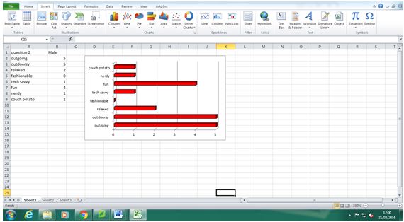
question 2 for our questionnaire is that the majority of males where outgoing,
outdoorsy and fun which is what we expected from our target audience to be like
that enjoyed the trailer. Our target audience are described as rugged
traditionalists, funatics, and tribe wired which the majority of males from our
target audience has those characteristics. For the females, the majority of
them also responded with similar results as they too said they were outgoing,
outdoorsy, and fun but also fashionable. This suggests
 they also are put of our
target audience as they too share characteristics of rugged traditionalists,
tribe wired and funatics. The females also responded to like all three
ancillary texts by saying they were good or very good and no one (including the
males) said they did not like any of the ancillary texts which shows that the
three ancillary texts contains multiple conventions of a zombie apocalyptic
film that suits the taste of the target audience which has the characteristics
of rugged traditionalists, funatics, and tribe wired which in theory these
audience profiles will only like this genre of texts.
they also are put of our
target audience as they too share characteristics of rugged traditionalists,
tribe wired and funatics. The females also responded to like all three
ancillary texts by saying they were good or very good and no one (including the
males) said they did not like any of the ancillary texts which shows that the
three ancillary texts contains multiple conventions of a zombie apocalyptic
film that suits the taste of the target audience which has the characteristics
of rugged traditionalists, funatics, and tribe wired which in theory these
audience profiles will only like this genre of texts.
 they also are put of our
target audience as they too share characteristics of rugged traditionalists,
tribe wired and funatics. The females also responded to like all three
ancillary texts by saying they were good or very good and no one (including the
males) said they did not like any of the ancillary texts which shows that the
three ancillary texts contains multiple conventions of a zombie apocalyptic
film that suits the taste of the target audience which has the characteristics
of rugged traditionalists, funatics, and tribe wired which in theory these
audience profiles will only like this genre of texts.
they also are put of our
target audience as they too share characteristics of rugged traditionalists,
tribe wired and funatics. The females also responded to like all three
ancillary texts by saying they were good or very good and no one (including the
males) said they did not like any of the ancillary texts which shows that the
three ancillary texts contains multiple conventions of a zombie apocalyptic
film that suits the taste of the target audience which has the characteristics
of rugged traditionalists, funatics, and tribe wired which in theory these
audience profiles will only like this genre of texts. We also learned from our audience
what conventions where found/ associated with the film trailer. The males that
responded with this question mostly said that they identified the conventions
of isolation and survival. This fits into the main genre of this text as it
includes conventional themes of isolation and survival which is commonly found
in other films of the same genre, which suggests that the text made was
successfully made and fits in well within the genre as this is supported by the
large number of responses from male respondents that answered that question.
We also learned from our audience
what conventions where found/ associated with the film trailer. The males that
responded with this question mostly said that they identified the conventions
of isolation and survival. This fits into the main genre of this text as it
includes conventional themes of isolation and survival which is commonly found
in other films of the same genre, which suggests that the text made was
successfully made and fits in well within the genre as this is supported by the
large number of responses from male respondents that answered that question. For the females, they responded by
identifying conventions of death, isolation and survival. Again these
conventions are included within the film trailer which tells us that this film
trailer is successful and fits in within the zombie apocalyptic genre well as
these conventions can also be identified within other film trailers of this
genre such as 28 Days Later (2002) , Resident Evil (2002), and
Zombieland(2009), just to name a few.
For the females, they responded by
identifying conventions of death, isolation and survival. Again these
conventions are included within the film trailer which tells us that this film
trailer is successful and fits in within the zombie apocalyptic genre well as
these conventions can also be identified within other film trailers of this
genre such as 28 Days Later (2002) , Resident Evil (2002), and
Zombieland(2009), just to name a few. For the other ancillary text (film
poster) the male respondents answered the question that describes how well does
the film poster fit the conventions of the zombie apocalyptic genre in which
they all said it was quite well and very well with the majority saying it was
very well. This tells us the convention used within the film poster suits the conventions
that are expected within a film poster of this genre which describes the film
well but gives nothing away and creates hype and excitement.
For the other ancillary text (film
poster) the male respondents answered the question that describes how well does
the film poster fit the conventions of the zombie apocalyptic genre in which
they all said it was quite well and very well with the majority saying it was
very well. This tells us the convention used within the film poster suits the conventions
that are expected within a film poster of this genre which describes the film
well but gives nothing away and creates hype and excitement. The female
respondents responded by saying the film poster was quite well and very well
which the majority of the female respondents saying the film poster was very
well which also suggests that from both perspectives that the film poster
possesses conventions that is expected within a film poster of this genre. This
tells us that it is successful and fits in well within the genre as these
conventions can be seen within other film posters of this genre such as 28 Days
Later, World War Z and REC.
The female
respondents responded by saying the film poster was quite well and very well
which the majority of the female respondents saying the film poster was very
well which also suggests that from both perspectives that the film poster
possesses conventions that is expected within a film poster of this genre. This
tells us that it is successful and fits in well within the genre as these
conventions can be seen within other film posters of this genre such as 28 Days
Later, World War Z and REC. For the question that describes how
suitable the ancillary text of the magazine cover is to the genre of the zombie
apocalypse , the male respondents all said it was suitable to the genre which
suggests that the magazine covers has all the conventions of the genre and the
conventions of a magazine cover. These conventions can be identified by the
target audience and by other audiences to who may not like this genre but are
able to identify the conventions seen within the text which suggests that this
text is successful and fits in well with the genre of the zombie apocalypse.
For the question that describes how
suitable the ancillary text of the magazine cover is to the genre of the zombie
apocalypse , the male respondents all said it was suitable to the genre which
suggests that the magazine covers has all the conventions of the genre and the
conventions of a magazine cover. These conventions can be identified by the
target audience and by other audiences to who may not like this genre but are
able to identify the conventions seen within the text which suggests that this
text is successful and fits in well with the genre of the zombie apocalypse.  These conventions within the text can be seen
within other magazine covers such as Total Film Magazine that displayed Shaun
Of The Dead and mainly focused on the film which shared similar conventions with
the magazine cover and also with the film magazine Fangoria which displayed the
film Zombie on the front cover.
These conventions within the text can be seen
within other magazine covers such as Total Film Magazine that displayed Shaun
Of The Dead and mainly focused on the film which shared similar conventions with
the magazine cover and also with the film magazine Fangoria which displayed the
film Zombie on the front cover.
For planning and research for the film trailer, we used audience feedback
from the preliminary video (teaser trailer) in which we displayed some main
conventions of the zombie apocalyptic horror genre within the 10-15 second
video in which we asked the audience for their feedback. The audience feedback
helped us decide what conventions to include and what conventions not include
within the theatrical trailer. The whole audience said they liked the title
font that it fits in well within the genre of zombie apocalyptic horror as
similar title fonts from the genre of zombie apocalypse horror such as Shaun Of
The Dead and Virus which displays conventions of blood/gore, zombies, darkness
and isolation which the title font used within the preliminary video conforms
to the same conventions. Due to the audience’s positive feedback for these
convention used, we chose to use the convention used and keep the title font
similar within the theatrical film trailer. The whole audience also said that
the main protagonist within the preliminary video intrigued them as the main
protagonist was represented as mysterious due to the costume and performance of
the main protagonist. We decided to focus this convention used within the preliminary
video for the theatrical film trailer as we want to appeal to the target
audience as much as possible. Most of the audience said that the location used
fitted in well with the genre of the film as the location (woods) connotes
conventional theme of isolation which creates more suspense, mystery (creates
more intellectual puzzles (Altman) for the audience, which will keep them
engaged within the text) and vulnerability for the protagonist as the
convention used ‘the fear of the unknown’ as the audience does not know what is
lurking within the woods. But some of the audience did not think this location
was suitable with the genre as they expect to see more urban environments than
rural environments which maybe to do with how modern society is as more people
in modern society are exposed to urban environments rather than rural
environments and when they imagine an apocalyptic scenario, they will see
dystopic environments rather than isolated areas such as the woods, fields,
farms and the countryside. So we decided to keep the convention of the woods to
suit the tastes of the majority of the audience that said the woods fitted in
well with the genre as well as adding more locations to suit the rest of the
audience that did not agree with the location of the woods, which we add
locations such as streets, buildings and shots of urban areas to suit the other
audience’s taste as well as we want the theatrical trailer to appeal as much to
the audience as much as possible.
For the research, we gave the audience a questionnaire based on our
genre. The audience responded to what aspects within the genre they find
appealing which our target audience finds that gore/blood and death are the most appealing with the audience finding adventure, meaningful
violence and sustained fear the least appealing. These responses are what me
and my group expected due to the responses matching the profiles of the life
matrix audience as they are fun/atics, rugged traditionalists and tribe-wired. For rugged traditionalists, I
and my group hypothesised that they would like meaningless violence and
adventure due to rugged traditionalists' 'love of the outdoors'. So for the positive
responses received, we decided to include conventions that they find appealing within
the theatrical trailer as we want the theatrical trailer to appeal as much as
possible to the audience. The audience responded to what they think is the most
important convention used within a
zombie apocalyptic trailer which the highest response was action scenes in
which me and my group predicted as our target audience's life matrix profile is
rugged traditionalists in which they love the outdoors in which they tend to
love action scenes as it shows elements of survival in which relates to the
outdoors as rugged traditionalists like survival as it tests their strengths in
which they can experience a simulated pleasure of survival by watching action
scenes which creates the semantic experience of visceral pleasure (Altman) of
survival and action. So we decided to include conventions of action scenes and
fast paced editing as we want the theatrical trailer to appeal to the audience
as much as possible.
Question 4) How did you use media technologies
in the construction and research, planning and evaluation stages?

I used the internet to research the conventions of a film trailer and a magazine cover by using the search engine Google to find relevant information based upon my genre and the ancillary texts. I also used YouTube to research zombie apocalyptic trailers such as Resident Evil (2002) and 28 Days Later (2002) which I analysed the codes and conventions used within these trailer to help gain a further understanding of what conventions are usually used within a zombie apocalyptic trailer.

I used Microsoft windows desktop computer to help plan the theatrical film trailer by creating the script, narrative and synopsis using Microsoft word. I also used the internet to use the search engine Google to find a website that specialises in downloading storyboard templates for film making. I used the website Sampletemplates.com and downloaded a storyboard for film making to which I printed several sheets of the storyboard to which i drawn the scenes that might be used within the theatrical film trailer.
 For my construction for my
ancillary texts, I used an apple Macintosh computer to design and create my
magazine cover. I used several Photoshop tools such as layering, using shape
tools to create the circle/sticker, gradient and font tools such as using the
dissolved for font titles, crop tools to crop splash marks from the dissolved
font to add to various parts of the background .I used the program Photoshop
to create my magazine cover in which I used several fonts from Photoshop and
from the website Dafont which I used for other various fonts such as damned and
destroy which helps reinforce the conventions of a zombie apocalyptic genre
which will helps the target audience identify the conventions of this genre. For
the ancillary text of the film poster, the program Photoshop was used on an
apple Macintosh computer was used to construct the film poster.
For my construction for my
ancillary texts, I used an apple Macintosh computer to design and create my
magazine cover. I used several Photoshop tools such as layering, using shape
tools to create the circle/sticker, gradient and font tools such as using the
dissolved for font titles, crop tools to crop splash marks from the dissolved
font to add to various parts of the background .I used the program Photoshop
to create my magazine cover in which I used several fonts from Photoshop and
from the website Dafont which I used for other various fonts such as damned and
destroy which helps reinforce the conventions of a zombie apocalyptic genre
which will helps the target audience identify the conventions of this genre. For
the ancillary text of the film poster, the program Photoshop was used on an
apple Macintosh computer was used to construct the film poster.  The fonts that
were used on the film poster was from Photoshop and from the website Dafont
(can select fonts to download from a list of different fonts) which these fonts
help reinforce the conventions of a zombie apocalyptic film poster which
enables the target audience to identify the genre of this film poster as it
will create awareness for them that an upcoming product/text or help remind
them that the film is coming soon as we want it to be a successful and
mainstream as it possibly can be. On our film poster and magazine front cover,
we used links to the film’s official website. This shows that we understand the
power of EWOM and media convergence, as customers will be encouraged to go
online and explore the film’s website, where they will tweet/share on Facebook
links and information for it, thus providing the company with free viral
marketing.
The fonts that
were used on the film poster was from Photoshop and from the website Dafont
(can select fonts to download from a list of different fonts) which these fonts
help reinforce the conventions of a zombie apocalyptic film poster which
enables the target audience to identify the genre of this film poster as it
will create awareness for them that an upcoming product/text or help remind
them that the film is coming soon as we want it to be a successful and
mainstream as it possibly can be. On our film poster and magazine front cover,
we used links to the film’s official website. This shows that we understand the
power of EWOM and media convergence, as customers will be encouraged to go
online and explore the film’s website, where they will tweet/share on Facebook
links and information for it, thus providing the company with free viral
marketing. 
For the construction for the film
trailer we used media technologies such as a camera to record and film shots
needed to create the theatrical trailer.
An apple Macintosh computer was also
used to upload the shots/footage from the camera to the program iMovie which
then the shots can be edited and ordered in a sequence that best suits within a
theatrical trailer. Music was used from the program iMovie which helps
reinforce conventions of the zombie apocalyptic genre as the music is described
as sinister but progressive at the same time which creates an exhilarating but
mysterious and sinister effect on the target audience they will experience
visceral pleasures and intellectual puzzles (Altman) as a result.
 iMovie was
also used to record narration to go with the theatrical trailer which helps
describe what is seen on screen and also creates intellectual puzzles for the
audience and the narration also reinforces conventions of a \zombie apocalyptic
trailer as the narration is being told by the perspective of the main
protagonist. Google, the internet and the website Dafont was used to download
the font that was desired to be used to display the details surrounding the
film on the theatrical trailer such as the release date, year and the film
title. the program fireworks was used to help construct the
production/publisher company "Red Door Productions" which was chosen
as it suits the zombie apocalyptic genre and the horror genre as the door that
is red can symbolise that the viewer is entering a sinister and evil world as
the door is open and transitions to the beginning of the theatrical trailer/film which helps the
target audience identify the conventions of this genre just by seeing the
conventions used of the logo displayed before the theatrical trailer starts.
also it is very original as it has never been done before and the target audience's
memory of the film trailer will trigger when see the symbol appear which they
will as doors are seen everywhere which can suggest that the target audience's
viewing of the text will be sustained which helps sustain hype and excitement
based upon the theatrical trailer that they have seen.
iMovie was
also used to record narration to go with the theatrical trailer which helps
describe what is seen on screen and also creates intellectual puzzles for the
audience and the narration also reinforces conventions of a \zombie apocalyptic
trailer as the narration is being told by the perspective of the main
protagonist. Google, the internet and the website Dafont was used to download
the font that was desired to be used to display the details surrounding the
film on the theatrical trailer such as the release date, year and the film
title. the program fireworks was used to help construct the
production/publisher company "Red Door Productions" which was chosen
as it suits the zombie apocalyptic genre and the horror genre as the door that
is red can symbolise that the viewer is entering a sinister and evil world as
the door is open and transitions to the beginning of the theatrical trailer/film which helps the
target audience identify the conventions of this genre just by seeing the
conventions used of the logo displayed before the theatrical trailer starts.
also it is very original as it has never been done before and the target audience's
memory of the film trailer will trigger when see the symbol appear which they
will as doors are seen everywhere which can suggest that the target audience's
viewing of the text will be sustained which helps sustain hype and excitement
based upon the theatrical trailer that they have seen.
If I could have done the project
again, I would have used more media technologies, such as survey monkey to put
out a much more thorough and wide-reaching questionnaire to the public. I also
would have used logic pro to create the soundtrack from scratch if I’d have had
time. I also might have downloaded a free QR code for the film poster, although
they tend to be used on other forms of print advertising, rather than film
posters.

For the evaluation, Microsoft window desktop was used to create a questionnaire to allow the audience to assess all three ancillary texts to help give me and my group feedback based on our ancillary texts. The questionnaire was created using the program Microsoft word which is easy to use and the questionnaire can be made proficiently. I also used the Microsoft windows program Microsoft Excel to help collate the data and present the data in bar graph form to help show the significance of the data.

Wednesday, 23 March 2016
Ancillary texts questionnaire
Ancillary texts questionnaire
Here is the questionnaire for the ancillary texts (The Hunted).
The Hunted film
questionnaire
Q1.
What is your gender? (Please circle)
Male Female
Q2. Which one of the following words
best describes you? (Please circle)
Outgoing Outdoorsy Relaxed Fashionable Tech Savvy
Fun Nerdy Couch Potato
Q3. Which of the following did you
find most effective about the trailer? (Please circle)
Editing Soundtrack Locations Performers
Camera
shots Costume/Props
Q4. How well do you think we
portrayed a post-apocalyptic disaster world? (Please circle)
Poorly Quite well Very well
Q5. Overall how suitable do you think our main character
is for our post-apocalyptic disaster genre? (Please circle)
Not suitable Suitable Very suitable
Q6. Which of the following themes do
you feel was best communicated throughout the trailer? (Please circle)
Death Isolation relationship loss survival
Q7. Do you
think the locations used successfully represented a post-apocalyptic world?
(Please circle)
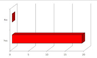
Yes No
Q8. If no
what locations do you think would have been more effective?
________________________________________________________
FILM POSTER:
Q9. How well
do you feel the poster represents the film trailer?
Poorly Quite well Very well
Q10. Do you
feel that the film poster resembles that of a professional film poster?
Yes No
If not, why?
________________________________________________________
MAGAZINE COVER:
Q11. Do you
feel that the magazine cover resembles that of an actual magazine cover?
Yes No
If not, why?
________________________________________________________
Q12. How
effectively do you think our three main products combine?
Poorly Quite well Very well
Tuesday, 23 February 2016


Storyboard for my trailer
Storyboard for my trailer
Here are the storyboard for my theatrical trailer.


For making the storyboard, I followed the narrative of the theatrical trailer and shared some ideas with my group members. I drawn the narrative in the way i would see the narrative on the theatrical trailer in which each box on the storyboard sheets describes each main shot well which has description of what audio, editing and shot type will be included with this shot within the theatrical trailer.
Subscribe to:
Comments (Atom)